
Simplify UX flow & structure to retain clients and activate new users
New interface & flow gave users time to breathe. New ones could get familiarised easier and existing ones didn't have to remember but to recognise. The revised IA architecture makes it now easier to develop future iterations and grow organically.
Case Study
In-depth Process
Confusing flow & cognitive overload causes users to abandon creating a workout midway
Heuristic analysis, interviews, usage diagrams and flows - all together tell the same story

Listening to existing user interviews was critical to shape understanding of why they want to create workouts as well as their vocabulary


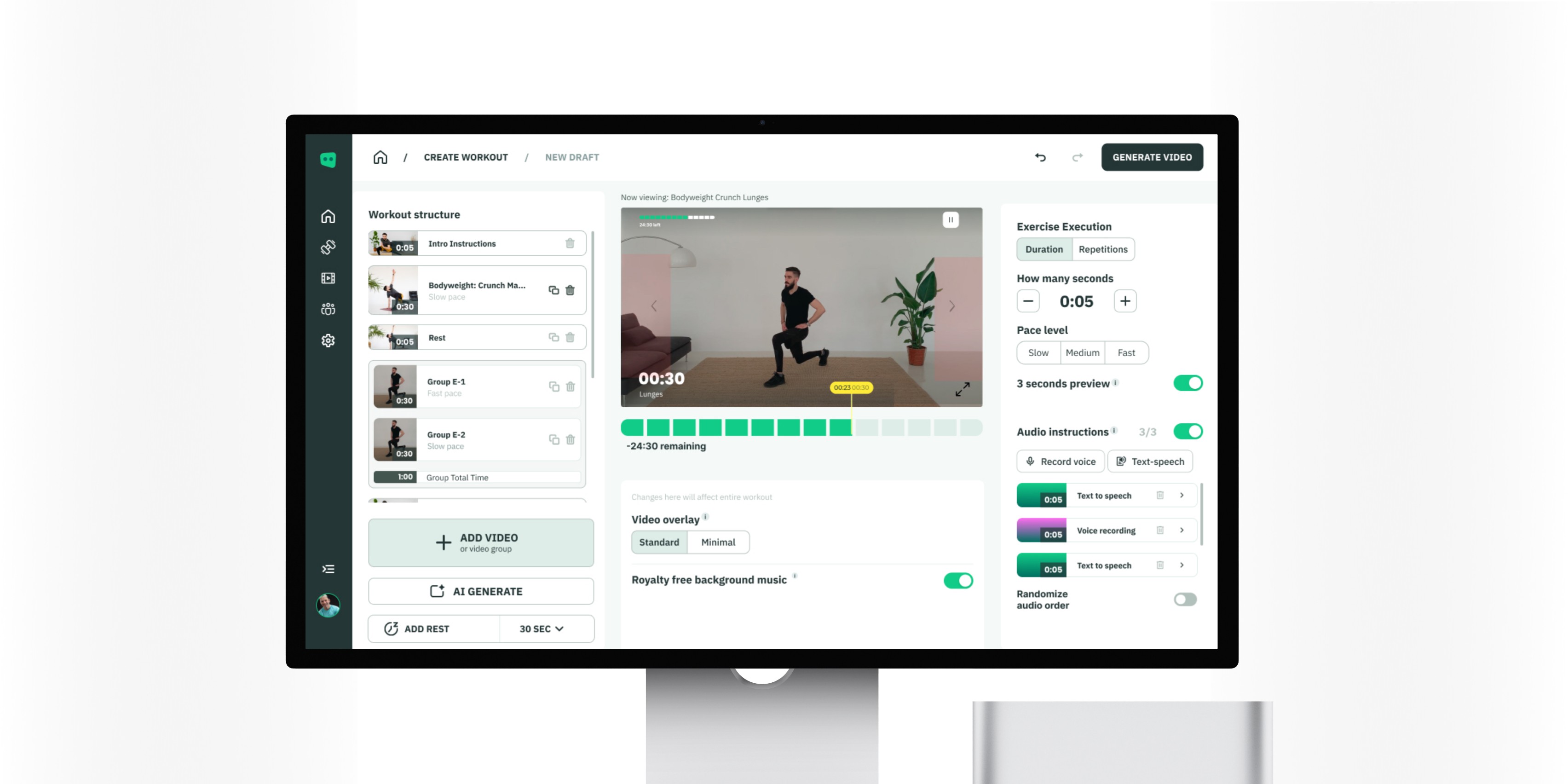
Splitting the creation process into manageable chunks
A heavy mental load is no joke. Users found themselves in front of many choices and decisions that they need to take. We simplified this by splitting the creation flow into individual smaller steps


Run competitor research and mark what went well for them
There's no point in reinventing the wheel, especially for well established patterns. Reusing established flows, components, and interactions had the aim of lowering the mental load users had to overcome. Keeping things familiar was a major goal.

Other workout competitors
Reuse common language & terminology with users

Online video editors
See which interfaces were most common and why

Slideshow builders
Building structure via blocks was a common practice here

Other recording software
Specific micro flows such as export & save function
Components created along the way streamlined production
We had clear UI goals in mind: improve user flows, hierarchy and consistency. This was done by reducing existing clutter, adding progressive disclosure, and create components for experiments

Revised & leaner styling
Existing branding was simplified by creating variations of the main color. Next, typography, shadows, and icon sets were revitalised

Does the shoe fit
Tailor everything for the main flow and build on that

Special components
The main creator screen required unique elements

Multiple molecules & organisms
Finally, items which were reused 3+ times were created into components. Some received special care - such as the side nav bar
Testing assumptions. What's the final step and complexity hidden under a button
The major goal accomplished - users could start and finish the entire revised flow within the new interface without any guidance. Both existing users as well as first timers. However, complexities arose: users were confused between interactive workouts & s.m. previews, features existed but weren't used, and a simple "publish" flow beneath a single button took 4 weeks to figure out.

Behaviour assumptions passed
New interactions such as drag & drop and stacking were confirmed during tests

What do we fit in the structure
Videos, video groups, breaks, intros, audios - define what figures as a block

Download vs API vs Upload YouTube
Found unexpected complexity when building the publish flow - specific per user
What's next
Although major goals were achieved, much more needed further testing. A particular question is whether the current build & flow corresponds to needs of enterprise users the same as for individuals. Furthermore, to harmonise efforts in IA simplification, the navigation and entire architecture needs a refresh.

Refreshed Navigation
How would the revised flow fit in a better overall system

Does it fit all personas
Enterprise customers need more testing to fully confirm